Web Fonts Without the Slowdown

Typography sets the tone of a website before anyone reads a word, but every family and weight you add is also a file to download. This guide puts real numbers on that trade. We measured what popular Google Fonts setups actually cost, from 23 KB for a single weight to 222 KB for a six-weight stack, and ran a live speed test on our own homepage to show where fonts appear in the results. Then come five steps: count your fonts, cap the families, trim the weights, keep text visible while fonts load, and spend the savings on readability.
Walk through any font library and the temptation is obvious: there are thousands of beautiful typefaces, and your site can wear any of them. The part nobody mentions at the checkout is that every family and every weight you pick is a file your visitors download before your words look right. Fonts are the only design decision that is also a performance decision, and most small business sites make it blind.
So we measured it. The numbers below are real downloads we ran while writing this post, pulled from the same servers your site would use. The spread is bigger than most people expect:
This guide is five steps: find out what your site loads today, cap the families, trim the weights, make sure text stays visible while fonts arrive, and then spend the bytes you saved on the thing fonts are actually for, which is comfortable reading.
Step 1: Find out what your site loads today
You cannot fix what you have not counted. Open your homepage in Chrome, press F12, click the Network tab, choose the Font filter, and reload the page. Every row is a font file; the Size column is what each visitor downloads on their first visit.
We ran this on our own homepage while writing this post, then ran Google's Lighthouse speed test on top to see the effect. The result: exactly two font files, 79 KB together, and a layout shift score of 0.001, which means the page barely moves when the fonts arrive.
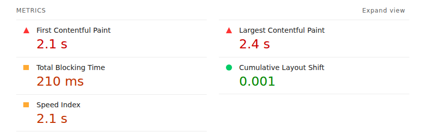
How to check it worked: count the rows in that Font filter. One to three files is healthy. Six or more files, or anything over 150 KB total, means the next three steps will visibly speed up your site.
Step 2: Cap it at two families
One font for headings, one for body text. That is the whole budget, and it is not just a taste rule. A 2025 study of 816 WordPress sites using Google Fonts found that sites loading four or more families had a median load time 2.7 seconds worse than sites loading one, the second largest gap the study measured. Almost one site in five was over that line.
Two families also look better. Most professional sites you admire use exactly two, or even one family in two weights. If your pages currently mix three or four, pick the two that carry your brand and retire the rest. Headings in a font with character, body text in something quiet and readable, and you are done.
How to check it worked: the Font filter from Step 1 should now show files from at most two family names.
Step 3: Trim the weights, they cost more than the fonts
Here is the part that surprises people: the expensive thing is rarely the font, it is the weights. Each weight (light, regular, medium, semibold, bold) is its own file. We downloaded five common setups from Google Fonts and weighed them:
| Setup | Weights | Files | Download |
|---|---|---|---|
| Inter, regular only | 1 | 1 | 23 KB |
| Lato, regular + bold | 2 | 2 | 45 KB |
| Inter, variable (every weight in one file) | 9 | 1 | 47 KB |
| Playfair Display, four weights | 4 | 4 | 150 KB |
| Montserrat, six weights | 6 | 6 | 222 KB |
Same servers, same day, measured by us. Regular plus bold covers almost every small business site, and it costs a fifth of the six-weight stack. The interesting row is the variable font: one file that contains every weight from thin to black for 47 KB. If your design genuinely uses three or more weights, pick the variable version of the family and you get them all for roughly the price of two.
How to check it worked: reload with the Network Font filter open. Fewer files, smaller total, same design.
Step 4: Keep text readable while fonts load
Even a small font file takes a moment to arrive, and the browser has to decide what to do with your text in the meantime. There are two behaviours, and the difference is the single most common font mistake on the web:
What a visitor sees during the first three seconds, by loading strategy. "Swap" keeps text readable the whole time, which is why it is the setting to check for.
The setting behind this is called font-display, and the value you want is swap: show a standard font immediately, switch to the brand font when it lands. Google's own font best practices guide recommends it for exactly this reason, yet the same 816-site study found almost one Google Fonts site in five still ships without it, leaving visitors staring at invisible headlines on slow connections.
If you use a website builder, this is decided for you, so it is worth checking rather than configuring. StoryPress sites load fonts with swap out of the box, which is why the layout shift in our Step 1 screenshot is 0.001: the text is on screen from the first paint and barely moves. If you run WordPress or hand-built pages, search your page source for font-display and make sure every font block says swap.
How to check it worked: open your site on your phone with mobile data, not Wi-Fi. If you ever see blank gaps where headlines should be, you still have an invisible-text problem.
Step 5: Spend the savings on readability
Speed is only half the job. The reason to choose fonts carefully is that people have to read them, usually on a phone, often in sunlight, sometimes past their first coffee. Four settings do most of the work:
Size: body text should be 16px at minimum; 18px reads better on most screens. If visitors pinch-zoom to read you, the font is too small, and Google's mobile checks will say the same.
Line length: 65 to 75 characters per line on desktop. Full-width paragraphs on a wide monitor force the eye on a long journey back to the start of every line, which is exhausting without the reader knowing why.
Line spacing: around 1.5 times the font size. Cramped lines read like a terms-and-conditions page; airy lines read like a book.
Contrast: dark grey or black text on a light background, or properly light text on dark. The fashionable thin light-grey text fails one visitor in twelve before style even enters the discussion. Google's type guidance covers all four of these in more depth if you want to go further.
Do
Pick one heading font and one body font, then stop
Load regular and bold only, until a design truly needs more
Keep body text at 16px or larger
Keep lines at 65 to 75 characters on desktop
Check for "swap" so text shows while fonts load
Do not
Add a third family because one page "needed" it
Load light, thin, and black weights you never use
Use thin grey text on a white background
Justify body text on the web, ragged right reads better
Assume fonts are fine because the site "feels fast" to you
How to check it worked: hand your phone to someone over fifty and ask them to read a paragraph aloud. If they squint, hesitate, or zoom, you have your answer.
The one-line version
“Visitors never compliment a font. They just leave when they cannot read.”
Two families, two weights (or one variable file), swap while loading, 16px or larger, short lines, real contrast. That is the entire typography checklist for a small business website. It costs nothing, it is done in an afternoon, and unlike most design advice, every step above comes with a way to prove to yourself that it worked.
One practical website guide, twice a week. No panic, no jargon.

Get Your Website Holiday Ready
Customers start searching for deals and holiday hours weeks before Thanksgiving, and search engines decide what to show them earlier still. That makes October, not late November, the month your website gets holiday-ready. This guide walks through the five jobs that matter: mapping the season's dates, building a sale page at an address you reuse every year (Google's own documented advice), syncing holiday hours across your site and Google, linking it all from the homepage, and freezing changes before the rush. Each step ends with a check.