Accessibility Basics Beyond Alt Text

Most owners file accessibility under legal worries and never open the folder again. That is a mistake on two counts: the fixes are small, and they help every visitor, not just the few using screen readers. This guide walks through five checks you can run in an afternoon with free tools: text contrast, keyboard navigation, link text, form labels, and one automated audit. We measured real contrast ratios for the greys designers love, counted the 42 tab stops on our own homepage, and ran Google's audit on ourselves. It flagged us three times. We kept the screenshot.
Every February, a nonprofit called WebAIM points an automated accessibility checker at the homepages of the top one million websites and publishes what it finds. The 2026 report landed with the worst numbers in years: 95.9 percent of homepages failed at least one automated WCAG check, the average page carried 56 separate errors, and both figures got worse since last year, not better. The most common failure by a wide margin is also the humblest: text without enough contrast against its background, found on 83.9 percent of homepages.
It is tempting to read that as permission to relax. If nearly everyone fails, how much can it matter? Flip it around: when 96 percent of the web gets the basics wrong, getting them right is one of the cheapest ways to stand out, and the people it helps are not a rounding error. Around 8 percent of men have some form of color blindness, nearly everyone past fifty reads low contrast text more slowly, and all of us become temporarily impaired the moment we take a phone into the sun or the trackpad dies mid-task.
We covered alt text in its own guide, so this post skips it. What follows are the other four checks plus one automated audit, and we ran every one of them on our own site before writing this. The audit caught us three times. The screenshot is below, unedited, because a guide that pretends its own house is spotless is selling you something.
Step 1: Check your text contrast
Contrast is measured as a ratio between the brightness of text and the brightness of whatever sits behind it, from 1:1 (white on white) to 21:1 (black on white). The accessibility standard, WCAG, asks for at least 4.5:1 on body text and 3:1 on large headlines. That is not an arbitrary bureaucratic bar; it is roughly the point where text stays readable for aging eyes and for cheap screens in bright rooms. The full rules live in the W3C's contrast documentation, but you never need to touch the math.
Light grey on white is where most sites fail, because light grey is what design taste currently sounds like: calm, minimal, expensive. We ran the official WCAG formula on the greys we see most often in the wild:
| Grey text on white | Contrast ratio | Verdict |
|---|---|---|
| #b3b3b3 | 2.10:1 | Fails everything |
| #999999 | 2.85:1 | Fails everything |
| #888888 | 3.54:1 | Large headlines only |
| #777777 | 4.48:1 | Fails body text by 0.02 |
| #767676 | 4.54:1 | The lightest passing grey |
| #595959 | 7.00:1 | Passes the stricter AAA bar |
The row to stare at is #777777. On screen it is indistinguishable from #767676, yet one fails body text and the other passes, which is why you check with a tool instead of your eyes. Paste any text and background pair into WebAIM's free contrast checker and it returns a pass or fail for each rule. How to check it worked: every text and background combination on your site scores 4.5:1 or better. For reference, the paragraph you are reading measures 16.3:1. StoryPress themes ship with passing pairs out of the box, but a custom brand color on a button can still slip below the bar, which is exactly how our own homepage got flagged in Step 5.
Step 2: Put the mouse away and press Tab
A meaningful share of visitors navigate by keyboard: people with motor impairments, screen reader users, power users, and anyone whose trackpad just died. The test costs nothing. Open your homepage, put the mouse out of reach, and press Tab repeatedly. Watch for three things. First, you must always be able to see where you are; each press should move a visible outline from link to link. Second, the order should follow the page, top to bottom, not jump around. Third, everything should be reachable and usable: menus open, forms accept input, Enter submits.
We ran it on our own homepage and counted 42 tab stops from the logo to the footer, each with a visible ring. The count is not the point; the visibility is. The most common way sites break this is one line of well-meaning CSS, outline: none, added because a designer found the focus ring ugly. Delete the ring without replacing it and keyboard visitors navigate blind:
How to check it worked: using only the keyboard, get from your logo to your contact form and send yourself a test message. If you lose track of where you are even once, you have found the bug.
Step 3: Rewrite your click here links
Screen reader users routinely skim a page by pulling up a list of its links alone, stripped of the text around them. A list that reads click here, click here, learn more, read more is a dead end. Sighted skimmers do the same thing visually, so descriptive links are faster for everyone. There is also a selfish reason: the words inside a link are an SEO signal, and see our wedding photography prices tells Google what the next page is about in a way click here never will.
Do
Name the destination: see our price list
Front-load the useful words: book a consultation
Keep links underlined or clearly set apart
Keep the linked phrase to 3 to 6 words
Do not
Use click here or read more as link text
Paste bare URLs into the middle of sentences
Mark links with a color change alone
Link an entire paragraph at once
How to check it worked: read only the linked words on your key pages, out loud, ignoring everything around them. If each one tells you where it leads, you pass.
Step 4: Give every form field a real label
The fashionable contact form writes its field names inside the fields as placeholder text, and the moment a visitor starts typing, the label vanishes. People with memory or attention difficulties lose track of which box is which, screen readers often announce nothing useful, and browsers autofill less reliably. A real label sits above the field and stays there. It also does something nobody expects: clicking a label focuses its field, so on phones the tap target effectively doubles in size.
While you are in the form, check the error states. Something went wrong is not an error message; please enter your email address is. How to check it worked: click every label and watch the cursor land in the right field, then tab through the whole form and submit it without touching the mouse. If you did Step 2 properly, this one is already half done.
Step 5: Run Google's free audit on yourself
Your browser ships with an accessibility auditor. In Chrome, right-click any page, choose Inspect, open the Lighthouse tab, tick Accessibility, and run it. Thirty seconds later you get a score out of 100 and a list of specific failures, each pointing at the exact element that caused it.
We ran it on storypress.app while writing this post. Score: 91. Flags: three. Our logo image was missing an alt attribute, our two main buttons failed the contrast check thanks to a brand color, and one blog card used a heading level out of order. The heading flag was sitting, with no sense of irony, on the card that links our alt text guide. Audits do not care whose house it is, which is exactly why they are useful.
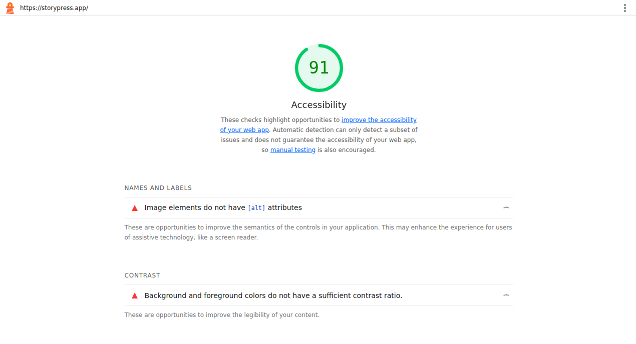
One honest warning, in both directions. A low score is real; every flag points at something you can fix today. A high score proves less than it suggests, because automated tools only catch what a machine can see. Lighthouse's own report says automatic detection can only detect a subset of issues. It cannot tell whether your alt text is meaningful, whether your tab order makes sense, or whether your links say anything useful. The five checks in this post exist precisely because the robot cannot run them. A 100 is not a certificate; it is a floor.
“Accessibility is not a legal project. It is five checks you can run before lunch.”
Run the five checks this week: contrast, Tab, links, labels, audit. Fix what fails, re-run, and you are ahead of roughly 96 percent of the web. None of this is charity, either. Higher contrast is higher readability, labeled forms are completed forms, and descriptive links are better SEO. The same afternoon of work pays three ways.
One practical website guide, twice a week. No panic, no jargon.

Web Fonts Without the Slowdown
Typography sets the tone of a website before anyone reads a word, but every family and weight you add is also a file to download. This guide puts real numbers on that trade. We measured what popular Google Fonts setups actually cost, from 23 KB for a single weight to 222 KB for a six-weight stack, and ran a live speed test on our own homepage to show where fonts appear in the results. Then come five steps: count your fonts, cap the families, trim the weights, keep text visible while fonts load, and spend the savings on readability.