H1, H2, H3: Get Your Heading Structure Right

Website audits keep flagging the same quiet problem: heading levels used in the wrong order. It sounds like pedantry until you see who depends on them. Screen reader users navigate by headings more than any other method. Google reads them to understand what each section is about. AI assistants treat them as your page's table of contents. This guide shows you the outline your page presents to all three readers, the four rules that actually matter, and how to check and fix everything in about ten minutes, no code required.
This morning we ran Google's Lighthouse audit on our own homepage. The accessibility score came back 90, and one warning sat in the middle of the report: "Heading elements are not in a sequentially-descending order." The culprit was a small box that says "Sign up". On screen it looks like a caption above a button. In the code it is an h5, three levels deeper than the heading before it, so the page's outline jumps from a chapter straight to a sub-sub-subsection.
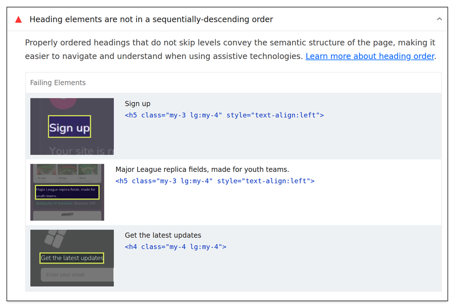
Nothing about that mistake is visible to a normal visitor, which is exactly why it is so common. This guide explains what heading levels actually do, who depends on them, and how to check and fix yours in about ten minutes.
Headings are an outline, not font sizes
HTML gives every page six heading levels, h1 through h6. Together they form an outline: the h1 is the title of the page, h2s are its chapters, and h3s are sections inside a chapter. The numbers describe structure. Size and styling are a separate job that your site's theme handles.
The mistake behind almost every heading problem is treating the levels as a font menu: "h2 looks too big here, I'll use h5 instead." That is how our own signup box became an h5. The text looked right. The outline went wrong.
Three readers who care more than you do
Screen reader users. In WebAIM's latest screen reader user survey (1,539 respondents), 71.6 percent said they find information on a long page by navigating through its headings, far ahead of any other method. "Missing or improper headings" also makes the survey's list of the most problematic things on the web. For these visitors, your heading outline is the main way around your site. The full results are on webaim.org.
Google. Here is the honest version, straight from Google's own SEO starter guide: "Having your headings in semantic order is fantastic for screen readers, but from Google Search perspective, it doesn't matter if you're using them out of order." Heading order is not a ranking factor. What headings do for Google is explain what each part of the page is about, so clear, descriptive heading text helps it match your sections to real searches. Order is for people; wording is for everyone.
AI assistants. When ChatGPT, Claude or Perplexity reads your site, it usually works from a stripped-down text version of the page, and the heading skeleton is the clearest structural signal left. A clean outline makes it far more likely the machine quotes the right section when someone asks what you do. This is why every StoryPress page also publishes a plain markdown twin: add .md to any page address, like storypress.app/blog.md, and you see your page the way an AI reader does, headings first.
The four rules that matter
| Level | What it does | How many |
|---|---|---|
| H1 | Names the whole page. One clear subject | Exactly one |
| H2 | Starts a major section, like a chapter | One per section |
| H3 | Splits a section into smaller parts | Only inside an H2 |
| H4 to H6 | Deeper nesting, rarely needed on normal pages | Usually none |
The W3C's accessibility tutorial on headings adds one nuance worth knowing: skipping levels on the way down is the problem, like an h2 followed directly by an h4. Skipping on the way back up is fine. An h2 can follow an h4, because it closes the previous section and starts a new chapter.
Check and fix yours in 10 minutes
Step 1: Look at the outline your page really has
Open your page in Chrome or Firefox, press F12 (or right-click anywhere and choose Inspect), click the Console tab, paste this line, and press Enter:
document.querySelectorAll('h1,h2,h3,h4,h5,h6').forEach(h => console.log(h.tagName, h.textContent.trim().slice(0, 60)))You get your page's outline, one heading per line. Read it as a table of contents. To verify this step: you should be able to tell what the page is about from the headings alone. If a line surprises you, like a signup label sitting at H5, you have found your fixes.
Step 2: Give the page exactly one H1
The H1 should name the page's one subject, usually the same promise as your title tag. If the list shows zero H1s or several, fix that first. To verify: run the console line again and count the H1 lines. One.
Step 3: Walk down one level at a time
Go through the list top to bottom and check every step down. H1 to H2 is fine, H2 to H3 is fine, H2 to H4 is a skip. Promote or demote headings until no downward step is bigger than one. The wording stays the same; only the level changes.
Step 4: Rescue the styling casualties
Any "heading" that is really a label, caption or button text should stop being a heading at all. Our "Sign up" box does not start a section of the page, so the right fix is not h2, it is bold text. If a heading exists only because of how it looks, restyle it and remove it from the outline. On a StoryPress site you can make this edit by asking: tell the editor which text should stop being a heading, and the level and styling are changed for you.
Step 5: Verify the whole page
Re-run the console line and read the outline once more, top to bottom. Then run your page through PageSpeed Insights, open the Accessibility section, and confirm the warning "Heading elements are not in a sequentially-descending order" is gone. That is the same check that caught our homepage.
Do and don't at a glance
Do
Write headings that say what the section contains
Keep one H1 that names the page
Step down one level at a time
Use bold text for small labels that are not sections
Don't
Pick a heading level because of its size
Use H5 for captions or signup boxes
Skip from H2 to H4 on the way down
Stuff keywords into every heading
“Headings are not font sizes. They are the table of contents your busiest readers use.”
One last note for the skeptics: none of this will rocket a page up the rankings, and anyone who promises that is selling something. What a clean outline buys you is cheaper and more durable. The 71.6 percent navigating by headings can actually use your site. Google understands what each section is about. And the AI assistants your customers increasingly ask for recommendations can quote you correctly. For ten minutes of renumbering, that is a good trade.

Set Your Google Holiday Hours Before December
December is the one month your Google listing gets checked more often than your website. Searchers want a single answer: are you open right now, and until when. This checklist walks through the Business Profile hours editor, the special hours that cover Thanksgiving through New Year's Day, the warning label Google adds when you skip them, and the free profile post that puts your schedule in front of everyone who finds you on Maps. Twenty minutes now saves a December of phone calls and doorway turnarounds.